
Inspiring Medical Spa Website Designs for 2026
A med spa’s website is more than a digital brochure – it’s a critical sales tool and first point of contact for clients. In fact, having one of the best med spa websites can be the difference between a booked schedule and missed opportunities.
A great medical spa website design doesn’t just look pretty; it builds trust, provides easy navigation, and drives visitors to take action (like scheduling a consultation). It must also meet practical needs like fast load times, mobile responsiveness, and even HIPAA compliance for any client forms. In short, the best sites blend beauty, branding, and functionality to convert curious browsers into loyal clients.
What makes a med spa website “great” in 2025 and beyond? Modern medspa website design focuses on user experience and timeless web principles over fleeting gimmicks. That means intuitive menus, clear calls-to-action (CTAs), high-quality imagery, authentic social proof (like real client testimonials and awards), and mobile-first performance.
Trends come and go, but fundamentals – like quick info access, simple booking flows, and strong branding – remain key. The goal is to make a visitor feel the spa’s luxury and professionalism through the screen, whether they’re on a desktop or scrolling on their phone.
As the spa industry continues to grow, investing in a great site is an evergreen marketing strategy. Below, we highlight 15 of the best medical spa websites (all U.S.-based, leaning toward luxury brands) that exemplify design and UX practices that will stay effective through 2026 and beyond. Use these spa website examples as inspiration for what works and how you can upgrade your own site.
💡 Want a website that books clients on autopilot?
Workee helps med spas launch high-converting websites with online scheduling, AI-powered sales funnels, CRM, and lead capture — all in one place. 👉 Book a free Workee demo
15 Outstanding Med Spa Website Examples (2026 & Beyond)
Each of the following websites showcases exceptional front-end design and user experience. We’ve included screenshots along with analysis of why each site works – from UX and branding to speed and layout. We also note the design elements that will remain strong in the coming years, what other med spa owners can learn or emulate, and how features like modern booking flows, HIPAA-compliant contact forms, and social proof are integrated.
1. Milk + Honey Spa – Austin, TX (and multiple locations)
Website: milkandhoneyspa.com – A luxury spa + med spa brand offering facials, massages, and medical aesthetics across multiple cities.

Milk + Honey’s website strikes a balance between spa serenity and modern e-commerce. The homepage uses a calming neutral palette and soft imagery to create an inviting, wellness-focused first impression. A prominent hero section features a gift card callout (a smart sales driver) and the tagline “We treat the whole you,” emphasizing the spa’s comprehensive wellness approach. The navigation is well-structured with a double header menu – one for spa/salon services and another for med spa treatments – which makes it easy to explore the full menu of offerings without feeling overwhelmed. Clear “Book an Appointment” buttons are displayed throughout the site, encouraging conversions at every scroll.
Why it works: This site seamlessly combines luxury branding with usability. The design is polished and upscale (reflecting a high-end spa ambiance), yet the layout is very practical – services are organized in a grid/boxed layout so users can browse treatments without excessive clicking. It’s a great example of form meets function.
Mobile-first performance: Milk + Honey’s site is responsive and loads quickly, offering a smooth experience on smartphones. The text and buttons are large enough for mobile tapping, and key info (like locations and booking links) is front and center. A fast, mobile-friendly site ensures on-the-go users can easily convert – a must for any med spa in 2025 and beyond.
Timeless UX elements: Notably, the site uses soft, calming colors and high-quality custom imagery, creating a soothing feel that aligns with spa services. There’s nothing gimmicky that will age poorly. The emphasis on wellness messaging (“treat the whole you”) and credibility (they highlight being a luxury brand with multiple locations) will hold up for years as marketing angles.
Easy booking & shopping: The constant presence of ‘Book Now’ CTAs and the integration of gift card purchasing show a strong focus on lead capture and revenue. Other med spas can emulate this by making sure their online booking or store is just one click away at all times. (Milk + Honey even has an online shop for products and clearly labeled medical spa treatments, catering to both impulse spa shoppers and serious treatment researchers.)
Learning for others: Med spa owners should note how Milk + Honey blends content – they include client testimonials and an educational blog, but keep the homepage uncluttered. Important promos (like seasonal specials or new patient discounts) are highlighted without disrupting the overall clean look. The takeaway: provide rich content, but design it in a way that feels organized and calming.
2. Revive Med Spa – San Diego, CA
Website: revive.md – A California med spa offering advanced skin treatments, lasers, and body contouring in a high-end clinic setting.
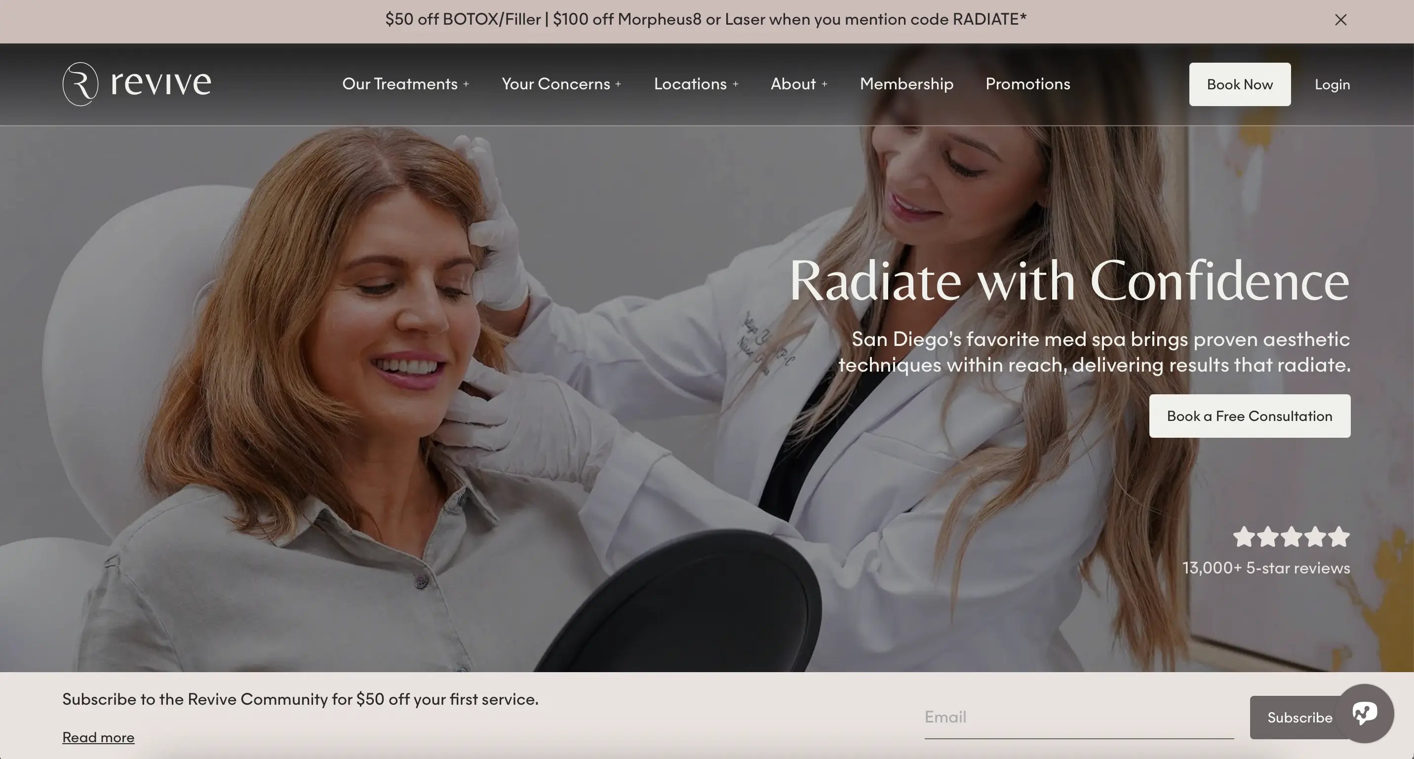
Revive Med Spa’s site immediately projects a sunny, aspirational lifestyle vibe, fitting for its Southern California roots. The hero section features a smiling woman in the sun with a bold headline “Revive Med Spa California” – visually communicating beauty and confidence. The design is clean and elegant, with an earthy color palette of sandy beige and white that feels warm yet professional. Custom photography throughout the site (including facility and treatment images) reinforces authenticity and lets visitors peek inside the experience. Large “Request a Free Consultation” and “Book Now” buttons are impossible to miss, making the desired user action very clear.
Why it works: Revive combines visual appeal with user-centric design. The site uses a full-width image slider on the homepage to showcase different services/promotions, immediately engaging visitors with what’s on offer. This dynamic element grabs attention but is used thoughtfully (with high-quality images and concise text) so it’s effective, not distracting.
Strong branding: The look and feel align with Revive’s identity – fresh, uplifting, and expert. The use of real client before-and-after photos and media mentions adds to credibility. They subtly include logos of press or awards near the footer, which builds trust without overtly bragging. This kind of social proof placement is smart and something other med spas should implement to build authority.
Future-proof layout: The site’s elegance lies in its simplicity. Ample white space, a straightforward top navigation menu, and responsive design ensure it will continue to feel modern. There are no gimmicky animations or overload of effects – meaning the design won’t feel dated in a year or two. Revive focuses on clear information architecture (e.g., listing services, locations, memberships) which will always be in style.
Conversion focus: Key CTAs like “Book Now” are placed in the top menu and repeated in sections, so whether a user is browsing treatments or reading client reviews, they have a quick path to schedule. Also, a live chat widget appears for quick questions – a modern touch to capture leads. These features exemplify modern med spa marketing strategies built into the site (something a best med spa marketing company would definitely encourage).
Security & compliance: Revive’s consultation form and booking system appear to be integrated with secure, professional software (the site even mentions “Call or Text” for appointments, indicating a client-convenient approach). This attention to a smooth, secure booking flow means they likely handle patient data carefully. It’s a reminder that HIPAA-compliant online forms and encrypted appointment requests are behind-the-scenes essentials of any great med spa website.
Learning for others: Med spa owners should study how Revive blends visual storytelling with clean layout and CTA placement. Use real photography and reinforce credibility with awards or press, but ensure it supports a fast, intuitive user experience. A sunny, confident visual tone can help convey results and luxury without overcomplicating the layout.
3. Tribeca MedSpa – New York, NY
Website: tribecamedspa.com – A premier NYC medical spa known for advanced skincare, injectables, and body treatments in a boutique setting.
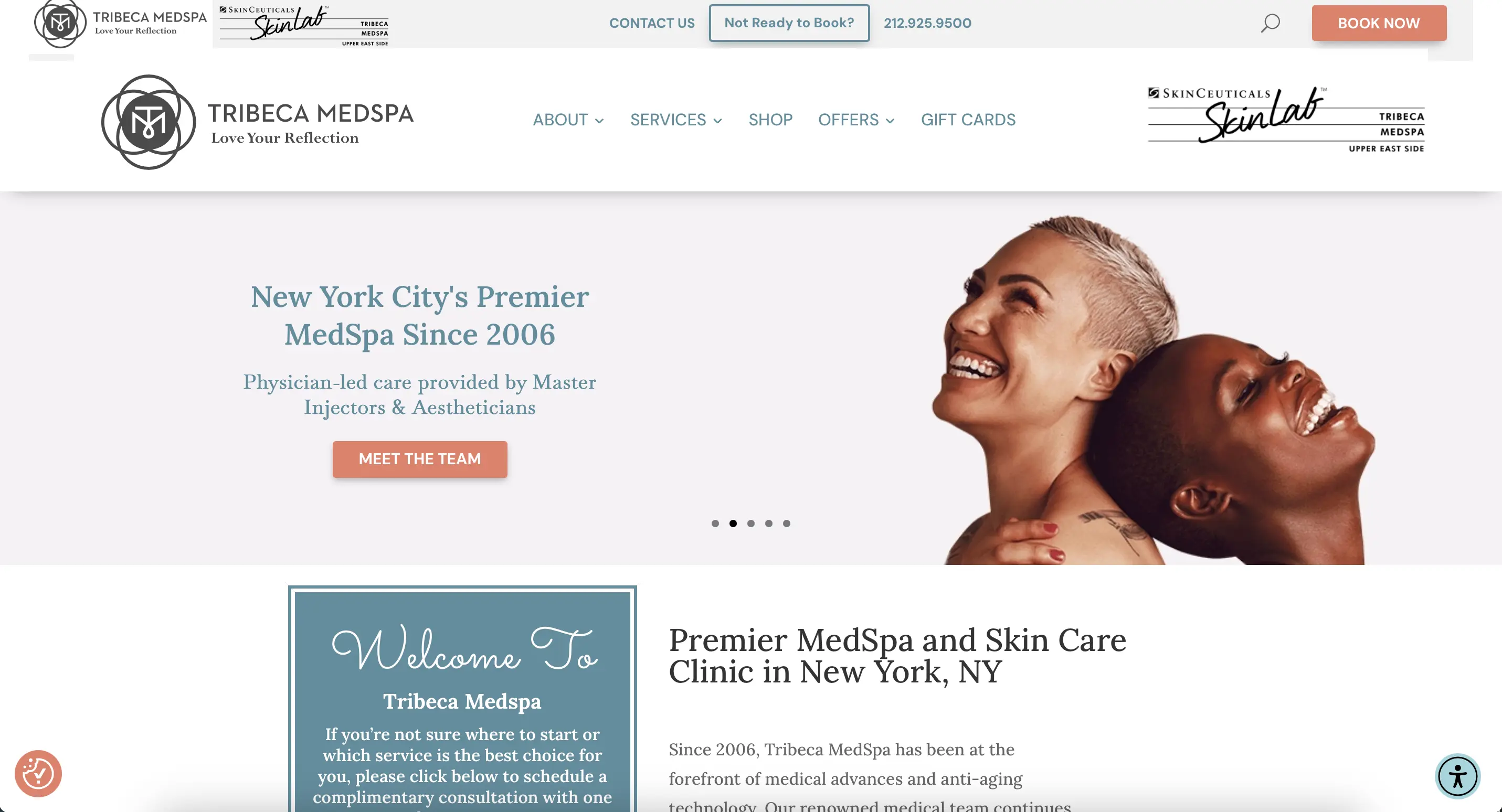
Tribeca MedSpa’s website exemplifies clean, upscale design with intuitive usability. The homepage immediately communicates prestige – from the “Premier MedSpa in New York City” tagline to the sleek top navigation bar. A rotating banner highlights key treatments and promotions (like CoolSculpting® offers) along with a clear “Learn More” CTA, engaging visitors from the start. The color scheme is soft and clinical (whites and subtle blues), giving a sense of cleanliness and expertise. Interactive service boxes on the homepage allow users to explore treatment categories at a glance, which makes discovering options effortless. Overall, the site makes a strong first impression that balances luxury and approachability – much like walking into their Manhattan spa.
Why it works: Tribeca MedSpa’s site is a textbook example of great med spa web design: it’s elegant but not overdone, and it guides the user journey smoothly. The navigation menu is comprehensive (covering About, Services, Shop skincare, Offers, Gift Cards) yet well-organized, so both new visitors and returning clients can find what they need quickly.
Design elements to emulate: Notice the effective use of color and spacing. Calls-to-action (like “Book Appointment” or contact info) are in a contrasting color that stands out without clashing. They also smartly incorporate trust signals – for instance, a “Welcome to Tribeca MedSpa” snippet outlines their legacy since 2006 and cutting-edge tech, which builds trust through text, while a banner shows logos of Skinceuticals partnership, etc., reinforcing credibility subtly. Other med spas can emulate this by highlighting years in business or professional partners to instill confidence.
Timeless UX: The site employs a classic layout – hero image + headline, then intro text, then service highlights, etc. This layout works in 2025 and will work for years because it aligns with how users scroll and consume info. Tribeca avoids any overly trendy fonts or animations; instead, it uses simple image sliders and hover effects that enhance usability. Such an approach ensures the site will remain fresh and effective long-term.
Lead capture and conversion: A fixed top bar includes a phone number and a “Book Now” button, recognizing that many visitors are ready to act quickly. They’ve also integrated e-commerce (an online shop for skincare), which is a growing trend for med spas to boost revenue. By having a “Shop” section, they cater to clients looking to purchase medical-grade products – a feature that can set a med spa site apart from a basic spa website.
Modern booking flow: Tribeca MedSpa uses a robust scheduling system (common in NYC clinics) – the site makes it easy to schedule consultations online. Ensuring this system is seamless is crucial. The combination of informative content + easy booking is what truly drives high conversion rates. Other spa websites should ensure that once a visitor is convinced (through beautiful design and info), the actual act of booking is frictionless.
Learning for others: Take note of how Tribeca MedSpa uses elegant structure and strong trust signals (years of service, partnerships, testimonials). Med spa owners should emulate their layout: simple service groupings, visible booking links, and soft yet authoritative branding that instills confidence from the start.
4. Laser Clinique – San Diego, CA
Website: laser-clinique.com – A medical spa and laser clinic specializing in laser skin treatments, cosmetic dermatology, and non-surgical enhancements.
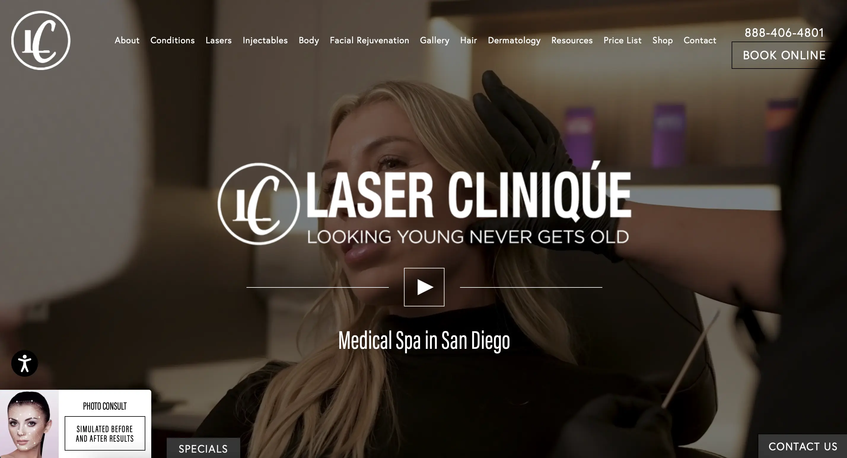
Laser Clinique’s website immediately grabs attention with a compelling hero video background. On load, visitors see short clips of real treatments and happy clients, overlaid by the clinic’s logo and tagline “Looking young never gets old” – a clever, memorable slogan that sets a friendly tone. The site’s design is modern and sleek: a dark transparent header bar overlays the video, and as you scroll, you encounter sections with bold headings, brief descriptions, and before-and-after image sliders that showcase real results. The navigation is expansive (covering Conditions, Lasers, Injectables, Body, Facial Rejuvenation, etc.), but thanks to a well-organized mega-menu, users can find specific procedures without feeling lost. An FAQ and resources section further cements their authority, answering common questions up front. Overall, Laser Clinique’s site feels immersive and informative right away.
Why it works: By using actual video and imagery of treatments, the site engages visitors emotionally – they can picture themselves getting that laser facial or body contouring. This is a powerful UX move that builds excitement and trust. The design also underscores their laser expertise by immediately showing their work. Any med spa with strong visual results could leverage this technique (with caution to keep load times fast).
Education & trust: Laser Clinique dedicates part of the homepage to a before-and-after gallery and even mentions a dedicated FAQ page addressing common questions. These elements position them as educators, not just service providers. Through informative content (like explaining each laser or injectable in plain language), the site appeals to savvy consumers who research thoroughly. This is a forward-looking strategy, as clients in 2026 will only become more educated and will gravitate to websites that inform as well as sell.
Timeless design choices: Despite the high-tech subject matter, the site’s layout remains clean and navigable. They use visual icons and a consistent format for each service page, which will hold up as design best practices. The color scheme (white backgrounds with navy/black accents and pops of color for CTAs) is classic medical-professional, conveying cleanliness and reliability. Such design won’t feel dated in a few years, whereas an overly flashy style might.
Conversion elements: The site features multiple ways to take action – a “Book Online” button in the header, a contact us widget, and even a special offer pop-up for a virtual consultation (“Photo Consult” upload feature). By offering an online photo consultation tool (as hinted by the “Photo Consult – simulate results” widget on the screenshot), they’re capturing leads who may be just browsing now but interested in personalized info. This kind of tech-savvy lead capture is something other med spas can adopt (and ensure any sensitive images uploaded are handled securely).
Security and compliance: With such interactive features (like before/after sliders, photo upload consults), Laser Clinique likely had to ensure their site is secure (SSL encryption, etc.). They prominently list their phone number and a “Contact Us” option, which implies that if someone fills out a form, it’s sent securely. This is a reminder: any modern med spa site, especially one handling images or health info, should be built on a secure platform with HIPAA considerations – an aspect often handled by the spa’s website builder or developer behind the scenes.
Learning for others: Laser Clinique shows the power of interactive content (video, before/after sliders, and FAQs). Med spas with strong treatment visuals or educational depth should explore similar formats. Help the client imagine results while answering their questions — all while keeping the interface uncluttered.
🚀 Inspired by these sites? Let’s build yours.
With Workee, you can turn inspiration into action — launch a sleek med spa site that reflects your brand and fills your calendar. 👉 Book a free Workee demo
5. Ject – New York, NY (and multiple locations)
Website: jectnyc.com – A modern boutique specializing in cosmetic injectables and skincare, with locations in NYC, LA, and beyond.
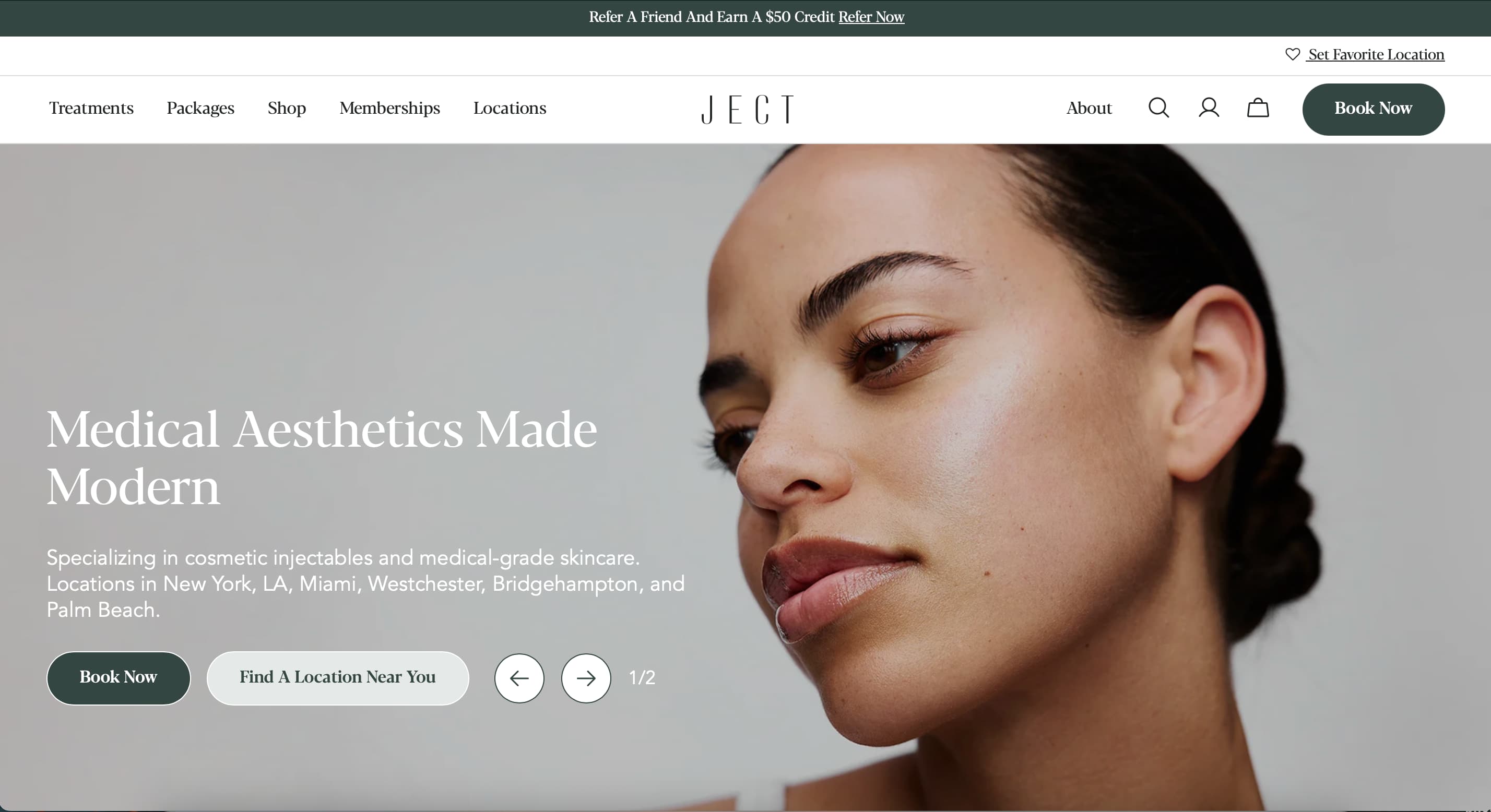
Ject’s website looks as chic as the brand’s metropolitan clientele. The design is minimalist and ultra-modern, using a cool sage green and white color scheme and plenty of open space. The homepage hero section rotates through refined images (close-ups of smooth, glowing skin) with the tagline “Medical Aesthetics Made Modern.” Two immediate CTAs invite action: “Book Now” and “Find a Location Near You,” acknowledging that Ject is a multi-location operation and funneling visitors accordingly. The navigation bar is slim and fixed at top, with just a few items (Treatments, Packages, Shop, Memberships, Locations) – signaling a focus on core offerings without clutter. Throughout the site, before-and-after photos and a stylized blog (“The Skinny”) add depth, but the overall vibe remains clean and focused. It’s clearly designed to appeal to a younger, trend-conscious audience while maintaining clinical credibility.
Why it works: Ject’s site is a masterclass in branding. Everything from the color palette to the copy tone (“Made Modern”) speaks to their positioning as a fresh, hip, expert provider of injectables. By keeping the design minimalist, the site loads quickly and feels like a high-end tech beauty startup rather than a stodgy clinic. This distinctive brand voice and look helps Ject stand out in a crowded market of med spas.
Mobile-first approach: Likely knowing that many clients will find them via Instagram or on mobile, the site appears optimized for small screens – large images, short texts, and big clickable cards for each treatment (Botox, Fillers, etc.). The “Book Now” button is highly visible on mobile just like on desktop. Ject’s seamless mobile experience is an element that will remain crucial in 2026 as more bookings shift to mobile devices.
Specialization can be a strength: Ject emphasizes injectables (even the name “Ject” implies injections) and their site content reflects that expertise – they highlight being leaders in cosmetic injections, show injector bios, and have blog posts about the latest in injectables. If your med spa has a particular niche or strength, don’t be afraid to build your site’s messaging around it. It can actually boost SEO for those services and attract the right clients.
Social proof & community: Ject smartly integrates a blog and likely social media feeds, positioning themselves as thought leaders. They might feature Instagram posts or have a hashtag campaign tied into the site. This not only adds fresh content (good for SEO) but creates a sense of community – clients see real people engaging. Testimonials on the site are pulled from real reviews (some are directly from Google reviews, giving authenticity). New med spa owners should note the value of authentic reviews displayed on their site – it’s far more convincing than generic quotes.
Modern booking & compliance: The presence of accounts (there’s a login icon for memberships and shopping cart for products) indicates Ject’s site doubles as a patient portal and ecommerce store. This means user data is involved, so the site likely uses secure databases. Ject’s tech-forward approach (online memberships, etc.) shows how med spas are evolving into digital-friendly businesses. The lesson: ensure your site’s backend (whether via a platform or custom build) can securely handle client accounts, and verify any such system is compliant with privacy laws. Ject proves that you can be cutting-edge and still protect client info – a non-negotiable combination for the future.
Learning for others: Ject is a model of brand clarity. Their clean, minimalist site design shows how med spas can appeal to younger, style-savvy clients without sacrificing credibility. Learning: Find your niche, lean into it visually and tonally, and make sure your mobile experience is flawless.
6. Beverly Hills Med Spa – Beverly Hills, CA
Website: beverlyhillsmedspa.com – A high-end Los Angeles med spa offering cosmetic treatments with a focus on luxury and cutting-edge technology.

True to its name, Beverly Hills Med Spa’s site embodies a glamorous, feminine aesthetic that targets its upscale market. The homepage features a refined lotus logo and a blush-pink color background – immediately setting a tone of elegance. Front and center is the tagline “Elevating Existing Beauty” along with badges of honor (RealSelf Top Doctor, award seals, etc.) and a note claiming “Best Med Spa in Los Angeles”. This prominent display of credentials and awards serves as instant social proof, telling visitors that this spa is reputable and acclaimed. The site’s navigation groups services cleverly by body area (Face, Body, etc.), and when you hover, it shows all the treatments under that category – a user-friendly way to let clients find what they need. A fixed top menu ensures the “Book a Consultation” button and phone number are always visible as you scroll, simplifying the path to conversion.
Why it works: Beverly Hills Med Spa’s website builds trust within seconds. By showcasing media features and awards right at the top, it leverages authority marketing – crucial for discerning clients in LA. Women visiting the site (likely a major demographic) are immediately welcomed by the luxurious color scheme and a clear message that this spa is both credible and catered to beauty enhancement.
Design & UX elements: The use of a soft pink and white palette, combined with high-quality imagery of attractive models and tranquil spa scenes, creates an aspirational mood. It’s inviting without being intimidating. Crucially, the site remains easy to navigate – the grouping of services by body area and the drop-down mega menus prevent overwhelming the visitor with the dozens of treatments offered. This organization will hold strong even as new treatments emerge (they can simply add a new item under the appropriate category).
CTA visibility: The fixed header with “Book a Consultation” is a great feature. No matter where a user is on the page, they can easily convert. This practice will continue to be effective in 2026 and beyond – people have shorter attention spans, so removing any friction (like having to scroll back up to find the booking button) can increase conversion rates. Other med spas should ensure a persistent CTA (whether it’s a sticky header or a constant footer bar on mobile) for quick access to booking.
Lessons for med spa owners: Don’t shy away from proudly displaying your qualifications and accolades. Beverly Hills Med Spa’s strategy of featuring press logos and award badges (“Best of LA”, etc.) front and center is highly persuasive . It’s done tastefully here, integrated into the design, not just slapped on – maintaining the site’s upscale feel. If your spa has any awards, memberships, or glowing press quotes, find a way to weave them into your homepage. It can dramatically boost a new visitor’s confidence in your practice.
Booking and compliance: Given the clientele, the site likely offers a contact form for consultations and maybe even an ability to upload a photo (for virtual consults). We notice it lists a phone number prominently as well, acknowledging that some clients may prefer to call. Ensuring that whichever way a client reaches out – via form, phone, or live chat – their information is handled securely is key. Beverly Hills Med Spa’s site likely uses secure forms (perhaps with a HIPAA disclaimer if medical info is collected). The takeaway: polish and security can go hand-in-hand – an elegant site should be backed by solid tech that keeps client data safe.
Learning for others: Luxury med spas should take cues from Beverly Hills Med Spa’s integration of awards and authority content into their design. The takeaway: polish is persuasive. Display trust badges and accolades early, but in a tasteful, brand-aligned way. Make CTAs easy to access at all times.
7. La Jolla Plastic Surgery & Dermatology – La Jolla, CA
Website: lajollaskin.com – A combined plastic surgery, dermatology, and med spa practice in San Diego known for cosmetic excellence.
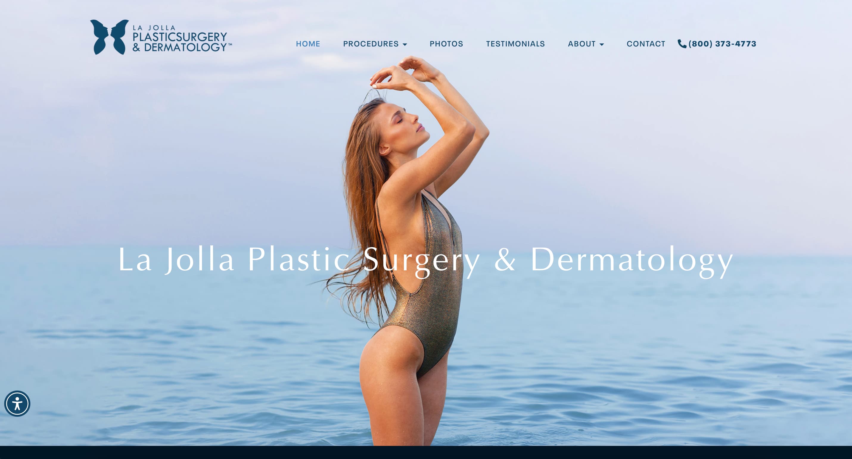
The La Jolla Plastic Surgery & Dermatology site blends the worlds of medical professionalism and spa luxury. Opening the homepage, visitors are met with a striking full-width image of a graceful figure by the ocean, emblazoned with the practice name – instantly conveying a sense of aspirational beauty in a coastal California setting. The design utilizes a cool, deep blue color scheme (echoing the ocean theme) which gives a sense of trust and authority. Notably, the hero section opts for a static image rather than autoplay video – a deliberate choice that allows the dynamic before-and-after gallery immediately below to grab your attention. By showcasing dramatic patient results early on, the site proves its effectiveness visually. As you scroll, you find a concise introduction of the lead surgeons with their credentials, a clip of a TV media appearance, and an easy-to-find testimonials section – all carefully selected elements that build credibility. The site also includes an accessibility menu (visible icon), underscoring a commitment to ADA compliance and user experience for all.
Why it works: This website establishes trust at every turn. From highlighting board-certified doctors and their accolades to showing real patient results and media features, it reassures visitors of the practice’s expertise. The design balances the medical and spa facets well: it’s clean and authoritative enough for someone seeking a surgeon, yet also inviting and glossy for someone interested in a med spa treatment.
Timeless principles: The site employs a classic, easy-to-read font and straightforward layout for content sections (e.g., “About the Doctors”, “Media Appearances”, “Patient Testimonials”). By not overloading on text and using visuals smartly (like a video carousel of TV appearances ), it keeps users engaged without feeling like homework. These are evergreen web design choices – clear typography, sections that tell a story, and a logical flow of information will be as effective in 2026 as they are now.
What to emulate: If your med spa is physician-led or has notable experts, put them front and center as La Jolla P.S. & Derm does. A personal message or intro from the medical director, plus their credentials, can significantly increase a visitor’s confidence. Additionally, featuring a short TV clip or news article where your experts were featured (even local news) can set you apart – it’s proof that others recognize your authority. This site even goes a step further by embedding a Fox 5 News segment with Dr. Chaffoo, rather than just listing logos . It shows visitors and search engines that the content is original and valuable.
UX and navigation: Despite offering many services (plastic surgery, dermatology, med spa), the top menu is concise and user-friendly. Dropdowns are sensibly categorized, and you don’t have to click through multiple pages to get the gist of offerings. A user can find “CoolSculpting” under med spa or “Rhinoplasty” under surgery with equal ease. This kind of intuitive navigation is crucial for any hybrid practice and is maintained here with a careful site architecture. For other med spas, the lesson is to categorize services in a way that makes sense to laypeople, not just internally.
Accessibility & compliance: The presence of an accessibility widget (often to adjust font size, contrast, etc.) indicates the site is mindful of ADA web compliance – something increasingly important. This not only widens your audience (people with visual impairments, for example) but also potentially protects from legal issues. By adopting such features early, La Jolla P.S. & Derm future-proofs its site. Likewise, any med spa building or revamping a site should ensure their web design is accessible (proper alt tags on images, keyboard navigability, etc.) and that any patient forms are secure. This site is a great example of all-around best practices – high-quality design, rich content, and robust attention to user needs and safety.
Learning for others: La Jolla P.S. & Dermatology balances surgical authority and med spa appeal beautifully. If you’re a physician-led spa, showcase your team, credentials, and media presence with confidence. Use strong visuals but keep navigation logical and ADA-compliant for wide accessibility.
8. VIO Med Spa – (Franchise, various U.S. locations)
Website: viomedspa.com – A growing med spa franchise with locations across multiple states, offering a full range of non-invasive aesthetic treatments.
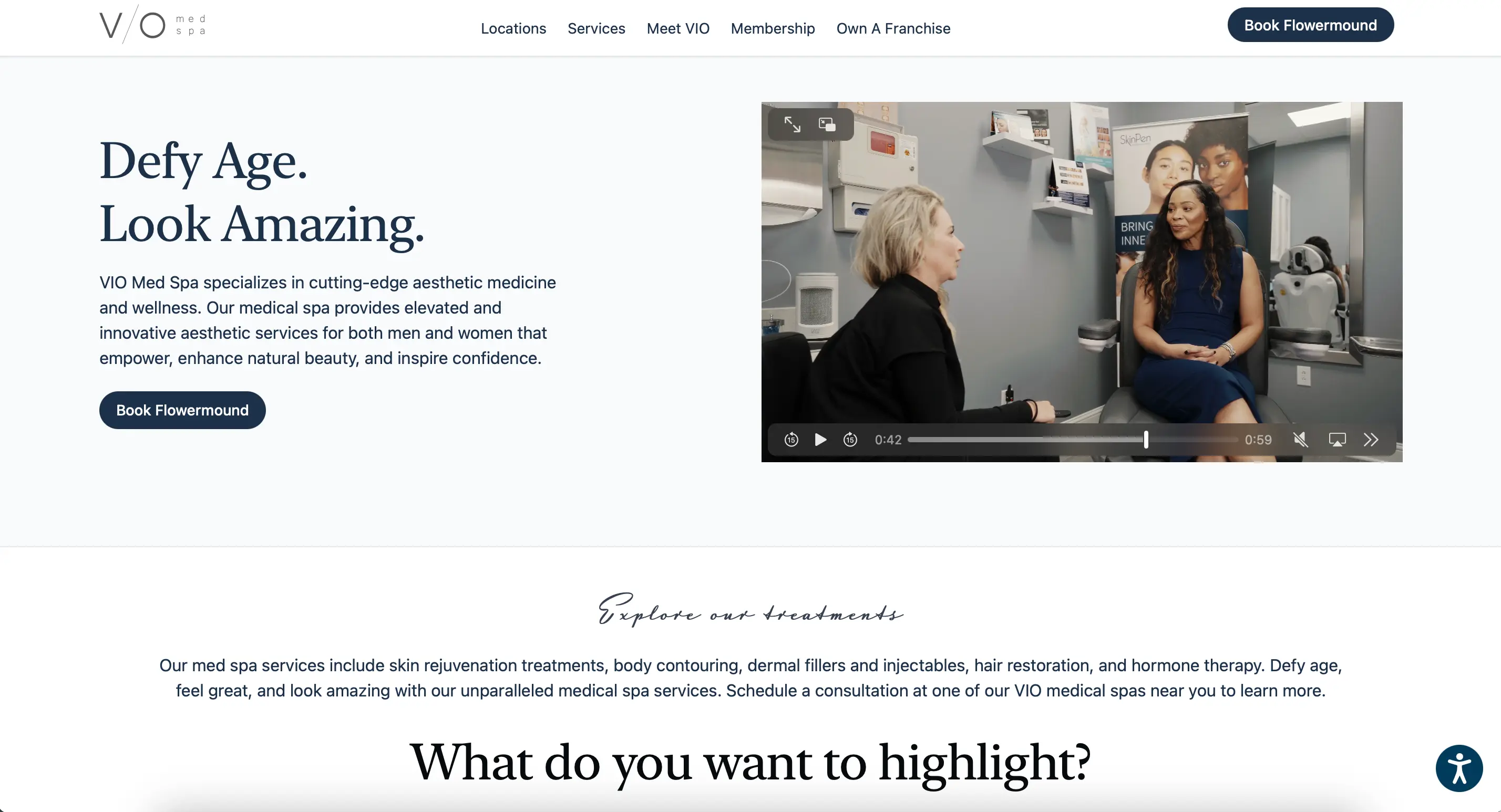
VIO Med Spa’s website showcases how a multi-location brand can still feel personal and local. The homepage is sleek and minimalist, with a tagline “Defy Age. Look Amazing.” accompanied by a short looping video of one of their spa storefronts and interiors. This gives a subtle sense of place – you see an actual VIO location (complete with signage) which builds familiarity. The design uses plenty of white space and modern thin fonts, creating a clean, contemporary aesthetic. Front and center is a location-finder CTA (“Book River North” in the screenshot, detecting a Chicago location) – an intelligent feature that geo-targets or allows quick selection of your nearest spa. Scrolling down, treatments are introduced with concise descriptions, and the tone of the copy emphasizes both luxury and results-driven care. Client testimonials and an Instagram feed appear as you scroll, giving social proof and a live peek into their community. Overall, the VIO site feels fresh, on-trend, and accessible to a broad audience.
Why it works: VIO manages to present itself as both a high-end boutique and a reliable national brand, which is no easy feat. The site’s minimalist design and strong headline messaging convey luxury and confidence (“Defy Age. Look Amazing.” isn’t just fluff – it’s aspirational and brief). Yet the inclusion of practical elements like a location map, franchise info, and memberships shows they have structure and breadth. This dual appeal likely helps them attract franchisees as well as clients.
Modern design elements: The use of a high-quality background video and custom fonts gives the site a distinctive look. These elements will continue to be popular in 2026, as internet speeds increase and users expect richer media. What VIO does right is ensure the video and design don’t hamper usability – the text is still high-contrast and readable over the video, and nothing feels laggy. It’s a lesson in using modern web tech gracefully.
Focus on conversion: Recognizing they have multiple locations, VIO’s primary CTA is a location-based booking – “Find a VIO Med Spa near you.” This is brilliant UX for a franchise: it immediately segments the user’s intent. If they’re on the site, they likely want to book, so funnel them straight to their nearest spa’s booking page. Any med spa with more than one location (or plans to expand) should consider implementing a store locator or auto-detect feature like this. It shortens the path from interest to appointment dramatically.
Trust signals: VIO’s site highlights that they have a nationwide presence, but also shares individual success stories (“75,000+ treatments performed”, etc., hypothetical metric). The testimonials section appears robust, and by having a presence of both men and women in their imagery, they subtly communicate inclusivity (appealing to a wider demographic). As a future-facing strategy, broadening the target audience (while still looking luxe) can be a big growth driver. Many med spas cater mostly to women; VIO shows men in their marketing as well, signaling that everyone is welcome.
Technical considerations: A franchise site likely integrates with a centralized booking system (perhaps each location has its own scheduling, but under one interface). Ensuring this is seamless is key – VIO probably uses a top-tier med spa CRM that coordinates bookings and client records across locations. The website acts as the spa sales funnel into that system. For other med spa owners, even if you’re not a franchise, using a solid scheduling platform (MindBody, Boulevard, Workee, etc.) that can grow with you is wise. Also, because VIO collects leads for many states, compliance with varying regulations (like for email/SMS marketing consent) is something the site likely handles via clear opt-ins. This forward-thinking approach to data and marketing compliance is something to keep in mind as privacy laws evolve in the coming years.
Learning for others: design for scale without losing warmth. Their location-finder funnel, consistent branding, and use of personalization (like recommending nearby services) are worth emulating. For multi-location brands, clarity + convenience is a winning combo.
9. Cienega Med Spa – Los Angeles, CA
Website: cienegaspa.com – A popular Los Angeles medical spa with multiple locations, specializing in wellness drips, injectables, and holistic aesthetic treatments.
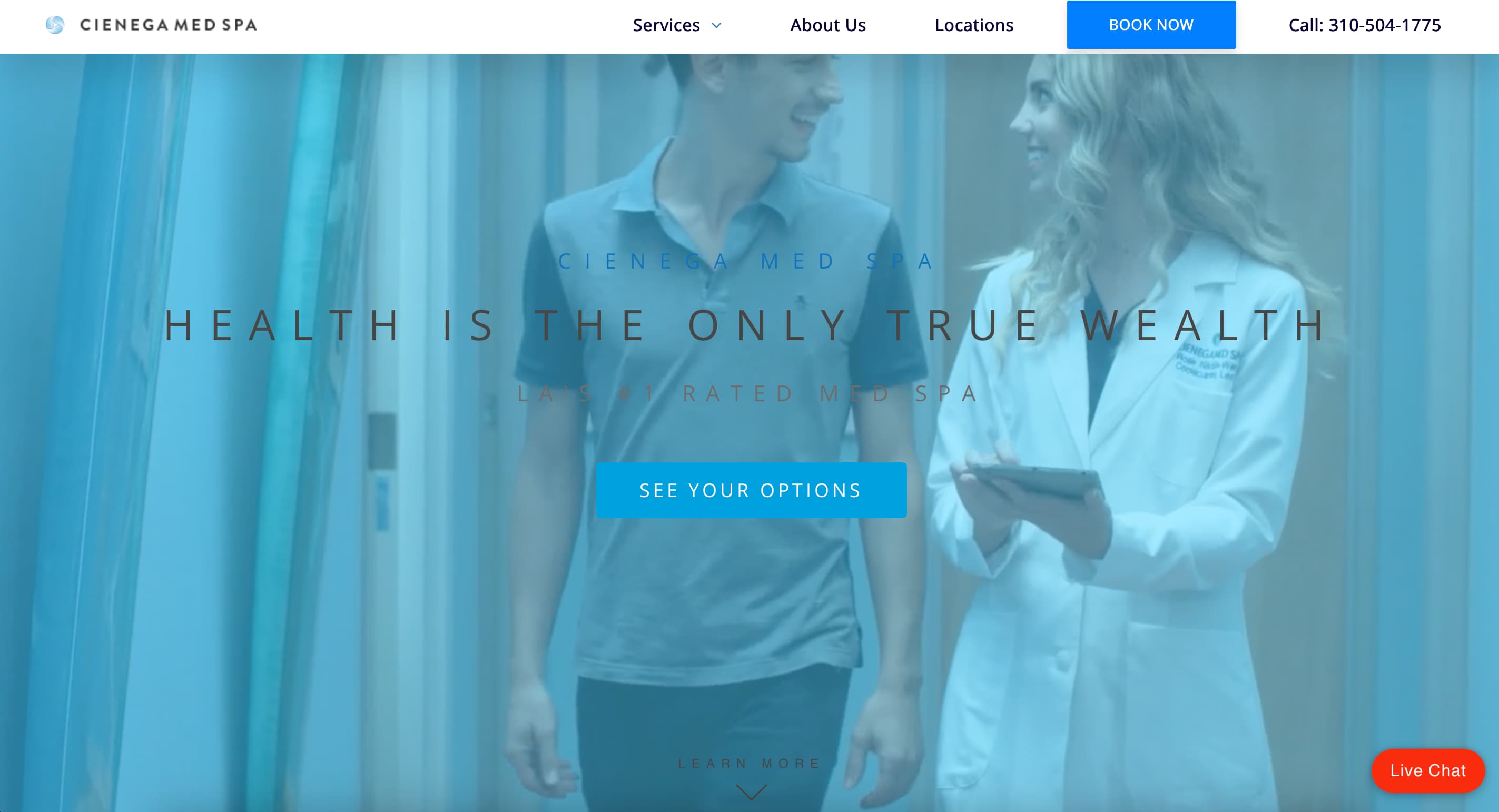
Cienega Med Spa’s homepage greets visitors with a cool blue overlay video of a friendly provider (likely a nurse) holding an iPad – immediately giving a welcoming, human feel to the site. The tagline “Living Your Best Life” appears over the video, aligning with the wellness-oriented approach they take. The design is clean, with the spa’s logo and menu on a white top bar contrasting the blue-tinted video background. Notably, the site features a “See Your Options” button prominently in the hero section, inviting users to explore treatments or schedule, which is a softer approach than a generic “Book Now” – it suggests a guided discovery for the visitor. As you scroll, bright splashes of color and high-quality photos accompany brief descriptions of their key services (IV Therapy, Body Contouring, Injectables, etc.), and icons are used to represent categories, making the info skimmable. The overall vibe is modern, upbeat, and health-conscious – positioning Cienega not just as a spa, but a lifestyle and wellness partner.
Why it works: Cienega’s site stands out by showcasing personality and energy. The use of a blue overlay video and vibrant accent colors gives it a unique visual identity (many med spa sites stick to white and neutrals). This helps brand recall – a visitor will remember the feeling of this site. At the same time, the core of the design is very user-friendly: clear service listings, straightforward language, and prominent CTAs.
Design/UX elements for the long run: The layout is simple: hero section, then services, then testimonials and a call-to-action. Simple is sustainable. Cienega’s choice of bright, optimistic imagery and color likely reflects their local LA vibe, but it’s done in a balanced way (notice the site still uses plenty of whitespace to avoid overwhelming the eye). That balance is what will keep the design appealing for years. They haven’t over-designed any element; even the use of icons next to service categories serves a functional purpose (quick visual cues) – a practice that aids scanning and will remain useful as content evolves.
Inject some brand personality into your site: Cienega does this by using a slightly informal, encouraging tone (“Living Your Best Life”) and showing smiling staff. It doesn’t feel corporate; it feels friendly yet professional. Prospective clients often choose med spas based on where they feel a connection or comfort. A website that is too sterile can be a turn-off. Cienega hits a nice middle ground by being professional (listing credentials, offering lots of info) but also fun and relatable. This strategy will continue to draw in especially younger clients who want a med spa that aligns with their lifestyle.
Modern flows & social proof: The site likely features online booking, but it also heavily emphasizes consultation and options – possibly routing users to fill out a quiz or a form to “see their treatment options.” This interactive lead capture (if present) is a smart way to engage undecided visitors. Additionally, Cienega integrates lots of social proof: patient testimonials, before-and-after images, and maybe even celebrity client shoutouts (common in LA). They might also highlight that they have X number of 5-star reviews on Yelp/Google, etc. Leveraging happy customer voices is a timeless marketing tactic; doing so on the website (with permission) can yield big trust gains.
HIPAA compliance & tech: Offering IV therapies and wellness consults means Cienega might allow some health history to be submitted online. Their site likely uses secure forms or directs patients to a portal for intake forms. By keeping these elements integrated yet secure (possibly using a third-party HIPAA-compliant form service embedded in their site), they ensure convenience doesn’t trump privacy. As telehealth and virtual consultations become even more prevalent, med spa sites should follow this lead – offer convenient digital options, but ensure the back-end is rock solid on security.
Learning for others: Cienega Med Spa demonstrates how personality and brand voice can shape user experience. Their optimistic tone, accessible pricing, and colorful layout strike a friendly balance. Med spas should explore how to make their site feel like an extension of the in-clinic vibe — warm, modern, and personal.
10. Skinney MedSpa – New York, NY & Miami, FL
Website: skinneymedspa.com – A full-service luxury medical spa with multiple locations, known for celebrity clientele and cutting-edge body contouring and skincare treatments.
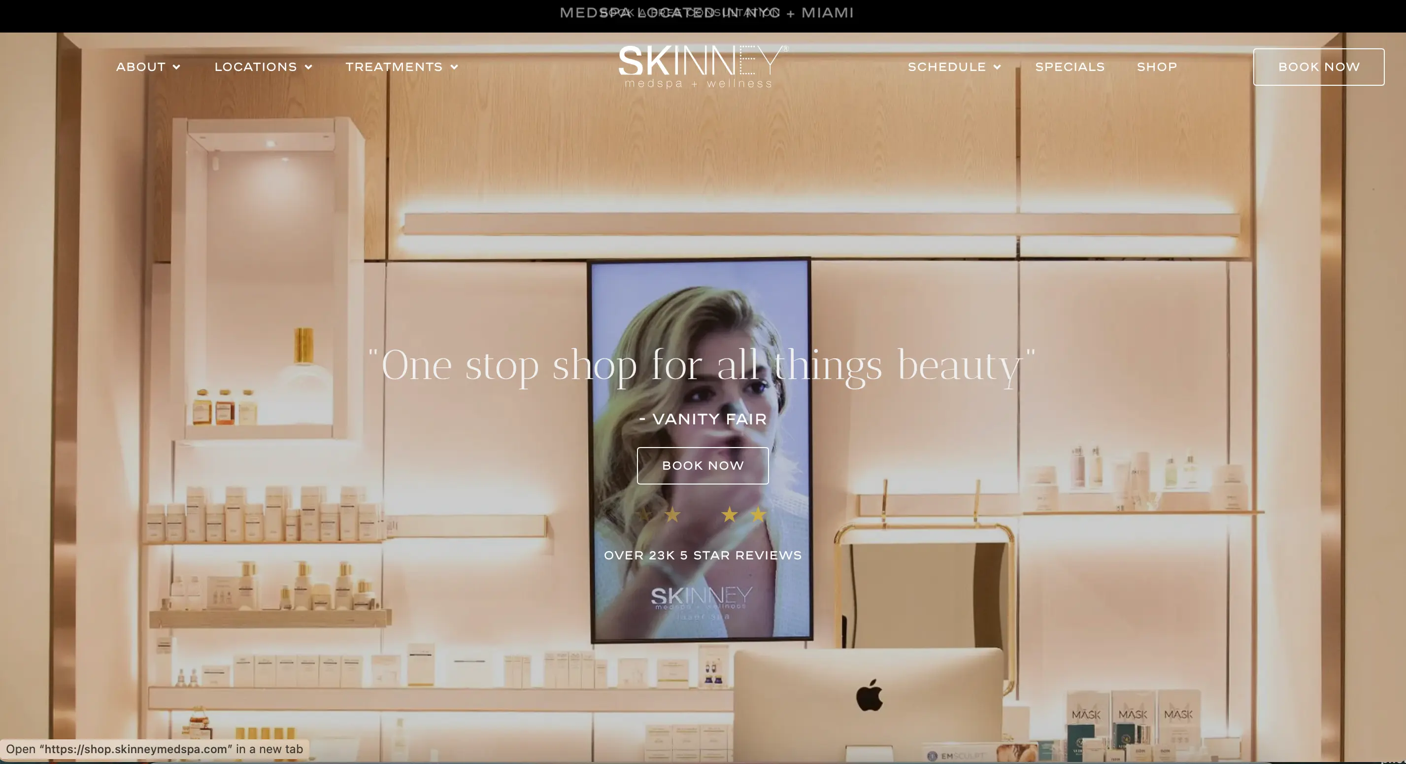
Skinney MedSpa’s website is the picture of modern luxury. The homepage features a stunning photograph of their flagship spa interior – a glossy, all-white lobby with plush seating – overlaid by a notable press quote: “One stop shop for all things beauty” – Vanity Fair, along with a bold “Book Now” button. This immediately positions Skinney as the place to go (if Vanity Fair says so!) and gives a glimpse of the high-end environment clients can expect. The design is very sleek: white background, black text, and minimalist gold accents for a hint of opulence. At the very top, a black notification bar offers a “Book a Free Consultation” which is a clever hook for new clients. The navigation is straightforward – Locations, Treatments, Clients (testimonials), Specials, Products, etc. – and an instant chat bubble is available if you need help. As you scroll, the site uses subtle animations: treatments fade in as you scroll, and there are short looping clips demonstrating procedures like CoolSculpting. Everything about the site feels polished, trendy, and trustworthy – exactly what a busy NYC or Miami client would want in a med spa experience.
Why it works: Skinney’s site leverages its star power and press credibility exceptionally well. By placing a Vanity Fair quote right on the hero banner, new visitors get an instant third-party endorsement – a powerful persuasion technique. The visual of the spa interior also sells the experience; it’s not just about the treatments, but the luxury setting. This combination of social proof and visual storytelling is highly effective and will remain so beyond 2026 (because trust and ambiance are timeless selling points for spa services).
Evergreen design qualities: The design is airy and elegant, with lots of white space and high-contrast text. This not only aligns with their brand (clean beauty, clinical results in a spa-like setting) but also makes the site easy to read and navigate. There’s nothing gimmicky – even the subtle fade-in effects are done in moderation, just enough to add a modern touch without distracting. Such a design philosophy ensures the site will age gracefully and require only minor tweaks (e.g., updating images or adding new press mentions) rather than major overhauls.
What to emulate: Skinney shows the value of showcasing your environment and ethos. Many med spa websites focus solely on faces and bodies of models or patients. Skinney also shows place – giving potential clients a feel for the clinic vibe. If your spa has a beautiful interior or a calming atmosphere, find a way to present that online (virtual tours, photos, etc.). Service businesses are experiential, so selling the experience (not just the outcome) can differentiate you.
Conversions and client journey: Skinney offers a free consultation, which is a great lead-generation tactic. By flashing that at the very top, they lower the barrier for new clients – you don’t have to commit or pay upfront, just come in and chat. This is likely connected to an easy scheduling feature. The Book Now is always visible in the header, and contact info is in the footer – pretty much every page invites action gently. Also, having a “Clients” section that likely includes testimonials from happy customers (maybe even celeb clients if any, or impressive transformations) helps visitors envision their own success story. New med spas can take a cue: dedicate a section of your site to client success – whether it’s testimonials, case studies, or user-generated Instagram before/afters. It personalizes the experience and builds community.
Tech and integrations: Skinney’s multi-city presence means their site likely integrates with spa scheduling software that can handle multiple locations and time zones. They also sell products online (noted by a Products link and likely an e-commerce integration), which requires secure payment processing. By offering both services and products, Skinney taps into e-commerce revenue – something many med spas are starting to do by selling skincare lines. This trend will only continue, so consider adding an online store with your curated products, ensuring the checkout is secure and user-friendly (as Skinney’s likely is). With all these moving parts, a stable website platform or a good developer is key – performance remains fast on Skinney’s site, proving that with the right optimization, even feature-rich sites can load quickly (critical for SEO and user retention).
Learning for others: Skinney MedSpa exemplifies the power of press and ambiance. Med spa owners can learn to market not just services, but environment and vibe. High-end visuals and third-party validation (press quotes, testimonials) work best when integrated cleanly into the homepage.
✨ Build a med spa site that actually converts
Don’t just admire these designs — get your own! Workee powers beautiful, fast, and functional websites for modern spas. 👉 Book your free consultation
11. LaserAway – Nationwide (U.S.)
Website: laseraway.com – America’s largest laser hair removal and aesthetic dermatology chain, with over 100 locations offering laser treatments, injectables, and body contouring.
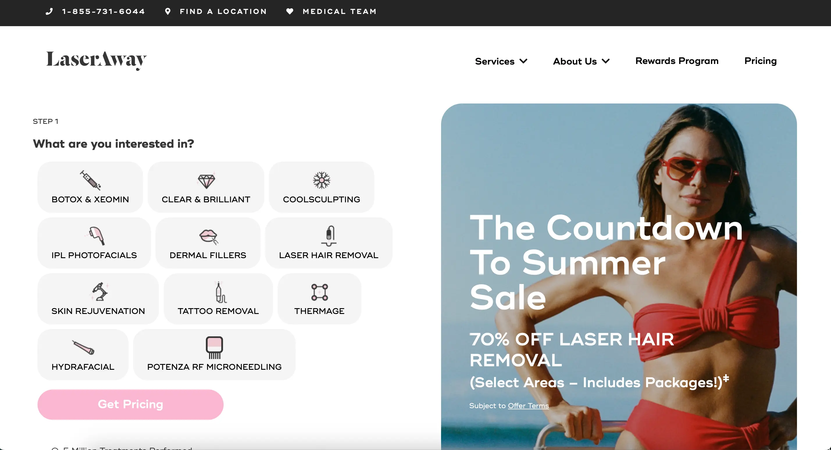
LaserAway’s website demonstrates how a big brand can still deliver a tailored user experience. The homepage is bold and promotional: it features models showcasing smooth skin, alongside a prominent banner advertising “The Skin Fit Sale – Up to 65% Off Laser Facials & More.” This immediate highlighting of a sale appeals to deal-seekers and conveys that LaserAway is competitive on pricing – a smart move for such a large chain. On the right side of the hero, there’s an interactive quiz-like menu asking “Which one are you interested in?” with options like Laser Hair Removal, CoolSculpting, Botox, etc., leading the user through a step-by-step inquiry process. This is essentially a guided booking funnel that personalizes the experience.
The site’s style is vibrant and youthful, with lots of high-quality photos, poppy colors, and a mix of sans-serif and script fonts for a fun vibe. Despite having a huge range of services and locations, the site feels navigable thanks to clear sections and a persistent top menu that includes a Location finder and Book Online button. LaserAway clearly invested in making sure their site can handle scale – it’s part e-commerce (for product sales), part informational hub (with an extensive blog and FAQ), and part scheduling portal – all rolled into one slick interface.
Why it works: LaserAway’s site is conversion-driven. The interactive “What are you interested in?” module is essentially a sales assistant that guides visitors to exactly what they want, then likely collects contact info to lock in a discount or appointment. This kind of user-driven flow will continue to be effective as users appreciate a customized path (and as AI possibly enhances such quizzes in the future). It reduces the paradox of choice on a site with many services by hand-holding the visitor. Additionally, the heavy promotion of specials indicates LaserAway knows its audience – even affluent clients love a good deal, and highlighting financing options or “Pay in 4 installments” (Affirm, etc.) appeals to a broad demographic without cheapening the brand.
Design elements: LaserAway’s brand identity is hip and bold, which their site reflects. They use lifestyle imagery (models in trendy outfits, as seen in the hero) to make treatments feel fashionable and normal – not medical or intimidating. The use of bright colors and large text for deals catches the eye. Importantly, all these design choices are backed by a highly organized layout. The interactive icons and step-by-step forms show a lot of info but in digestible chunks. This approach (hiding complexity behind interactivity) is something many websites will adopt going forward. Instead of one long form or overwhelming page, break it into steps or accordion sections. LaserAway was ahead on this, and it’s a design pattern with staying power.
Scalability and trust: Being a large chain, LaserAway’s site needs to build trust at scale. They prominently feature reviews and before/after galleries, and likely mention that they’ve done millions of treatments. The consistency of branding across all locations (the site likely serves as the template for each clinic’s mini-page) gives customers confidence that whichever LaserAway they visit, they’ll get the same quality. Smaller med spas can take a cue: ensure consistency in your branding across web and physical presence. Even if you only have one location, treat your site as the digital twin of your spa – the messaging, style, and promises made online should match the in-person experience to build credibility.
Lead capture & follow-up: LaserAway doesn’t let visitors slip away – the site likely uses exit-intent pop-ups or calls-to-action for a free consultation or discount if you try to leave. They also integrate chat support and encourage users to schedule a free consultation (often via a visible sticky “Book Online” button). Once a lead is in, they probably have a robust follow-up (emails, texts – which you implicitly consent to when you engage via the site quiz). This end-to-end funnel – from flashy ad to personalized quiz to booking to follow-up – is something med spa owners should study. It’s data-driven and optimized. Of course, with data comes responsibility: LaserAway’s site handles personal info (contact details, maybe even interest in medical procedures), so they ensure it’s transmitted securely and that consents are obtained (there are likely tick boxes for agreeing to terms/privacy when entering details). This is vital for legal compliance and will continue to be – always include a privacy policy and make sure your lead forms are secure. LaserAway’s success shows that marketing savvy + strong web infrastructure yields big results.
Learning for others: Build your website as part of a full client funnel. Their quiz-style flow, high-volume CTAs, and smart targeting of price-conscious users show how to capture and guide leads across multiple locations. Interactive UX + clear promos = scalable growth.
12. BeautyFix MedSpa – New York, NY
Website: beautyfixmedspa.com – A trendy NYC med spa known for affordable cosmetic treatments and a large social media following.
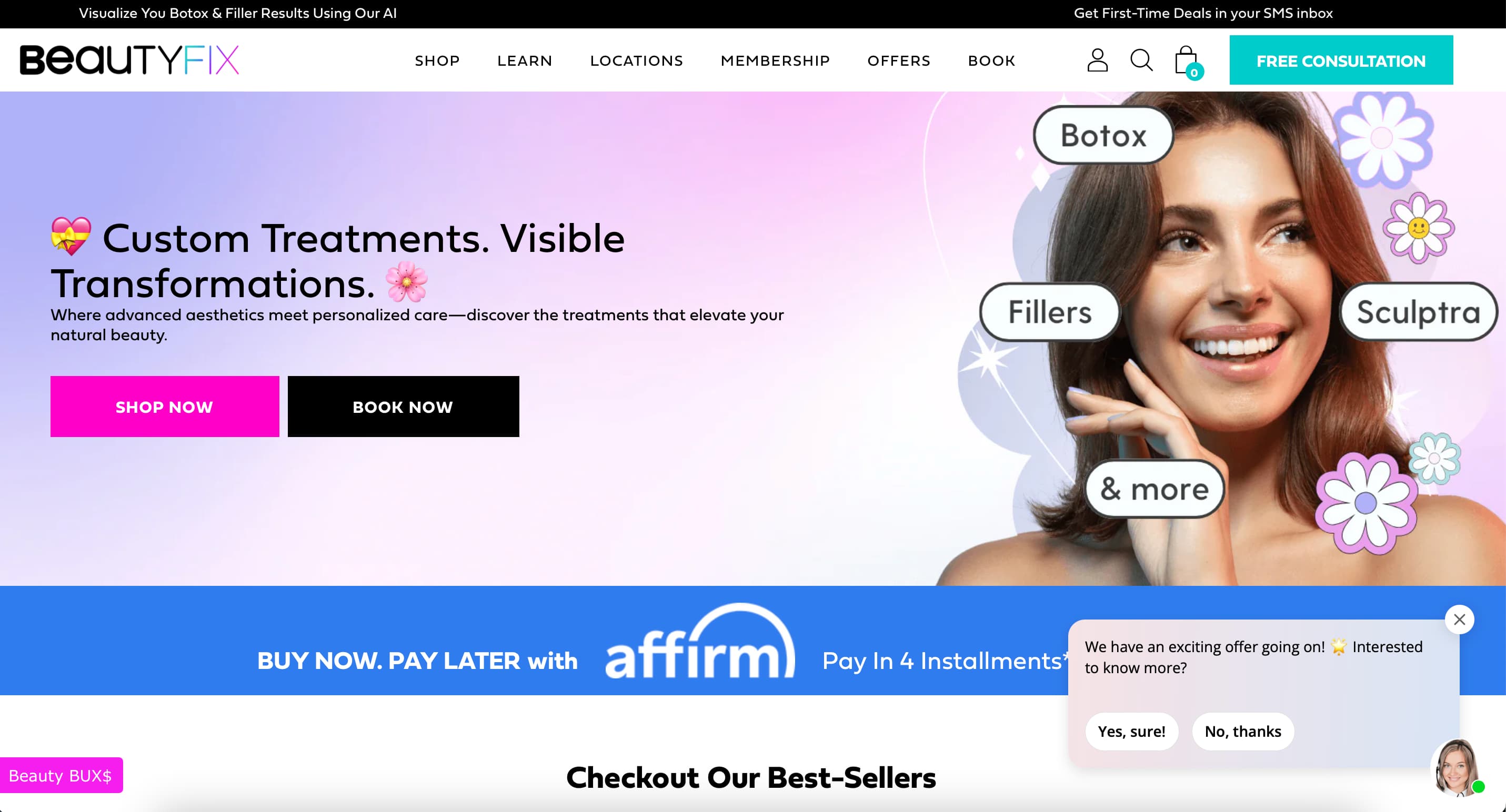
BeautyFix MedSpa’s website grabs your attention with a bold, text-first approach. The hero section features a catchy slogan “Get Your BeautyFix” in an oversized playful font, accompanied by a subheading “Get up to 40% off your next fix” – immediately communicating their value proposition of special deals for beauty maintenance. A prominent “Shop Now” button suggests e-commerce (selling skincare or even the ability to pre-purchase treatments). The design is very modern: lots of white space with black and hot-pink accents (matching their logo). Unlike some luxury spas, BeautyFix emphasizes accessibility and fun – evidenced by the presence of a celebrity endorsement right on the banner (a note “Becky G, American Singer-Songwriter, BeautyFix client” with her photo).
This signals that even celebs use them, yet the vibe is still youthful and edgy. Scrolling down, the site highlights their buy now, pay later options (Affirm financing) and loyalty points, showing a keen understanding of their target millennial/gen Z audience. Despite the flashy deals, the site is not cluttered – a simple top menu directs to Fixes (their term for treatments), an educational “Learn” section, Membership info, and more. BeautyFix’s site feels like a crossover between a fashion brand and a med spa, which is exactly its niche in the market.
Why it works: BeautyFix has differentiated itself by brand tone. The site’s fresh and urban aesthetic appeals to clients who might be new to med spa treatments and are shopping for the best deal without compromising on style. By embracing things like installment payments, they’re acknowledging that cost is a factor and making it easy to say “yes” – all while maintaining a cool image. This transparency and trend-savvy marketing (like using influencer clout with Becky G) is very effective now and will continue to be, as the next generation of med spa clients expects brands to speak to them and their lifestyle.
Design insights: The homepage’s use of large text and minimal imagery is actually a bold design choice that pays off here. It feels confident. BeautyFix knows its audience will likely find them via Instagram or word-of-mouth for specific deals (“Lip Filler flash sale!” etc.), so the site reinforces that with prominent text and easy calls-to-action. The clean layout with pops of color (pink for emphasis) is a design strategy that will remain visually appealing – it’s similar to popular direct-to-consumer beauty brand sites. So, they’re aligning the med spa experience with the broader beauty retail experience. That cohesion in design language can build trust through familiarity.
Marketing and UX: Notably, BeautyFix uses the term “Fixes” for treatments, which is part of their brand lingo. The site likely has a section listing all their “Fixes” (like “TummyFix” for CoolSculpting, etc., as they often brand their services with catchy names). This is clever marketing, but the site still ensures a new user can understand what it is (with hover tooltips or subtitles explaining each service). They also highlight memberships and points – a clear nudge to encourage loyalty in a price-sensitive segment. These UX elements – customized naming, rewards, financing – all contribute to a site experience built around conversion and retention, not just brochureware.
Know your audience and tailor your site accordingly: BeautyFix knows many of their clients are young professionals who are cost-conscious and social-media influenced. Thus, their site doesn’t shy away from mentioning price and promotions (whereas an ultra-luxury spa might avoid that on the homepage). Neither approach is wrong – it depends on your clientele. The key is consistency: BeautyFix’s messaging, from website to Instagram to in-clinic, likely all centers on making cosmetic treatments fun, affordable, and fashionable. Any med spa owner should ensure their website messaging aligns with their brand values and target demo. And if that means integrating modern tools like online installment payments or showing off influencer clientele, it can be worth the effort.
Future-ready elements: BeautyFix already implements things like online booking, e-commerce, and even virtual consultations (perhaps through their “Learn” resources or a chat). These digital conveniences will only become more expected. Also, the site’s backend likely captures a ton of leads via special offer pop-ups (“Sign up for 40% off one area” etc.) and they use that for email/text marketing. Given their younger audience, compliance with text marketing (TCPA, etc.) is important – we can assume they include the necessary disclaimers when one opts in for SMS deals. This points to an overall truth: a great med spa website in 2026 is not an island; it’s the hub of an omnichannel marketing system – from social media to email to in-person visits. BeautyFix’s site exemplifies this hub mentality, connecting all the dots in a customer’s journey.
Learning for others: BeautyFix MedSpa proves that fun, trendy branding can still drive serious business. Their use of influencer content, rewards, and bold copy speaks to a specific demographic. Learning: clarity of identity matters — speak your audience’s language, from homepage to checkout.
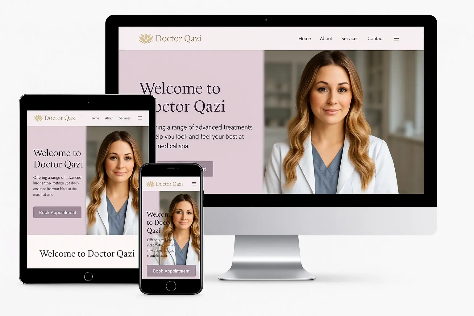
13. Qazi Cosmetic Center – Newport Beach, CA
Website: doctorqazi.com – A physician-led med spa and surgical clinic in Southern California known for scar correction, complex skin cases, and high-tech cosmetic procedures tailored for all skin types.
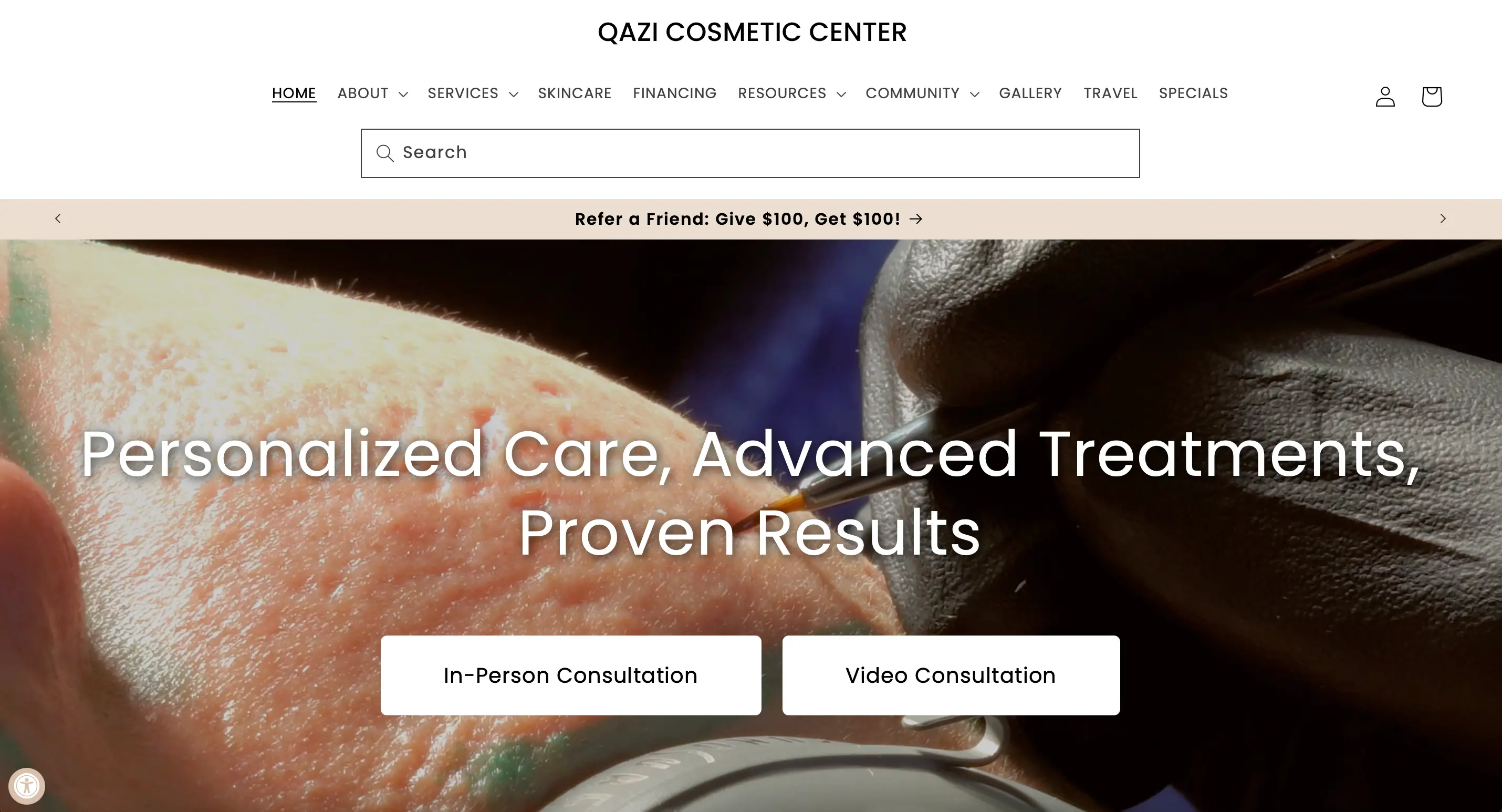
Qazi Cosmetic Center’s website takes a bold approach to communicating its specialty right from the homepage. The hero section features a dramatic dark background with gold-accented text reading “Get Rid of Acne Scars – For Good,” immediately signaling transformation and credibility. Unlike most med spa sites that lead with ambiance, this one leads with results. The dark-themed aesthetic continues throughout the site and is paired with elegant fonts and high-quality visuals, projecting confidence and luxury with a clinical edge. Navigation is clean, with focused menu items (Treatments, Conditions, Shop, Blog, Contact), while a floating WhatsApp button hints at their emphasis on modern communication and accessibility.
Why it works: Qazi’s website works because it knows exactly who it’s speaking to — people with real, often complex skin issues who haven’t found solutions elsewhere. It highlights that many clients travel from out of state or even abroad, subtly reinforcing exclusivity and expertise. Rather than a generic “We do Botox” message, it clearly communicates specialization in hard-to-treat conditions like acne scars, melasma, and keloids. For physician-led clinics with advanced capabilities, this style of site — confident, solution-focused, and clear — is especially effective.
Design insights: The black-and-gold theme sets a high-end tone and visually distinguishes the clinic from more typical pastel-toned spa websites. It’s not just for aesthetics: the darker background makes skin images (especially before/after comparisons) stand out more vividly. Typography is minimal and well-spaced, creating a premium and polished look. Subtle animations (like fade-ins) are used sparingly, keeping the experience smooth without distraction. It’s a visually bold but timeless approach.
Marketing and UX: The site strongly emphasizes conditions (e.g., “Acne Scarring,” “Pigmentation”) just as much as treatments — this is smart positioning. Many users don’t know which procedure they want, only the result they’re after. This approach appeals to symptom-aware clients. There are multiple trust-builders as you scroll: photos of Dr. Qazi in treatment, video testimonials, media logos, and even client-submitted stories. The inclusion of a prominent WhatsApp button and “Virtual Consult” link shows they understand modern client preferences for flexible, fast communication.
Know your audience and tailor your site accordingly: Qazi Cosmetic Center clearly targets clients who are seeking real change — not just maintenance. By emphasizing advanced technology, inclusivity (with expertise in darker skin tones), and physician credibility, they reassure visitors who’ve “tried everything else.” The copy tone is authoritative but approachable, striking a balance between medical excellence and aesthetic inspiration.
Future-ready elements: The site offers e-commerce for skincare, virtual consultations, and likely has a HIPAA-secure intake flow. It also appears to collect leads via consultation forms and quiz-style “What’s Right for You?” flows — essential for nurturing hesitant browsers. Add in educational content via blog posts and live Q&A sessions promoted on social media, and you’ve got a fully omnichannel setup that’s well-aligned with where digital aesthetics marketing is headed.
Learning for others: If you have a medical director or specialist with strong credentials, leverage that in your site as Qazi Clinic does. It adds credibility that can set you apart from non-MD competitors. Also, consider if a focused approach on common conditions (acne scars, aging skin, etc.) on your homepage could hook site visitors better than generic slogans. People often search by problem (e.g., “best treatment for acne scars”) – having that exact phrase on your site (and offering that solution) can draw them in. Finally, note the bilingual support: offering content or at least navigation in the primary second language of your region (Spanish, Chinese, etc.) can broaden your reach significantly. It’s a forward-thinking move as the U.S. consumer base becomes more multilingual; the best medical spa websites will accommodate and welcome those clients.
14. Upkeep Med Spa – New York, NY & Dallas, TX
Website: upkeepmedspa.com – A modern, women-owned aesthetic practice with locations in NYC and Dallas, offering injectables, laser treatments, and body contouring services in a sleek, minimalist setting.
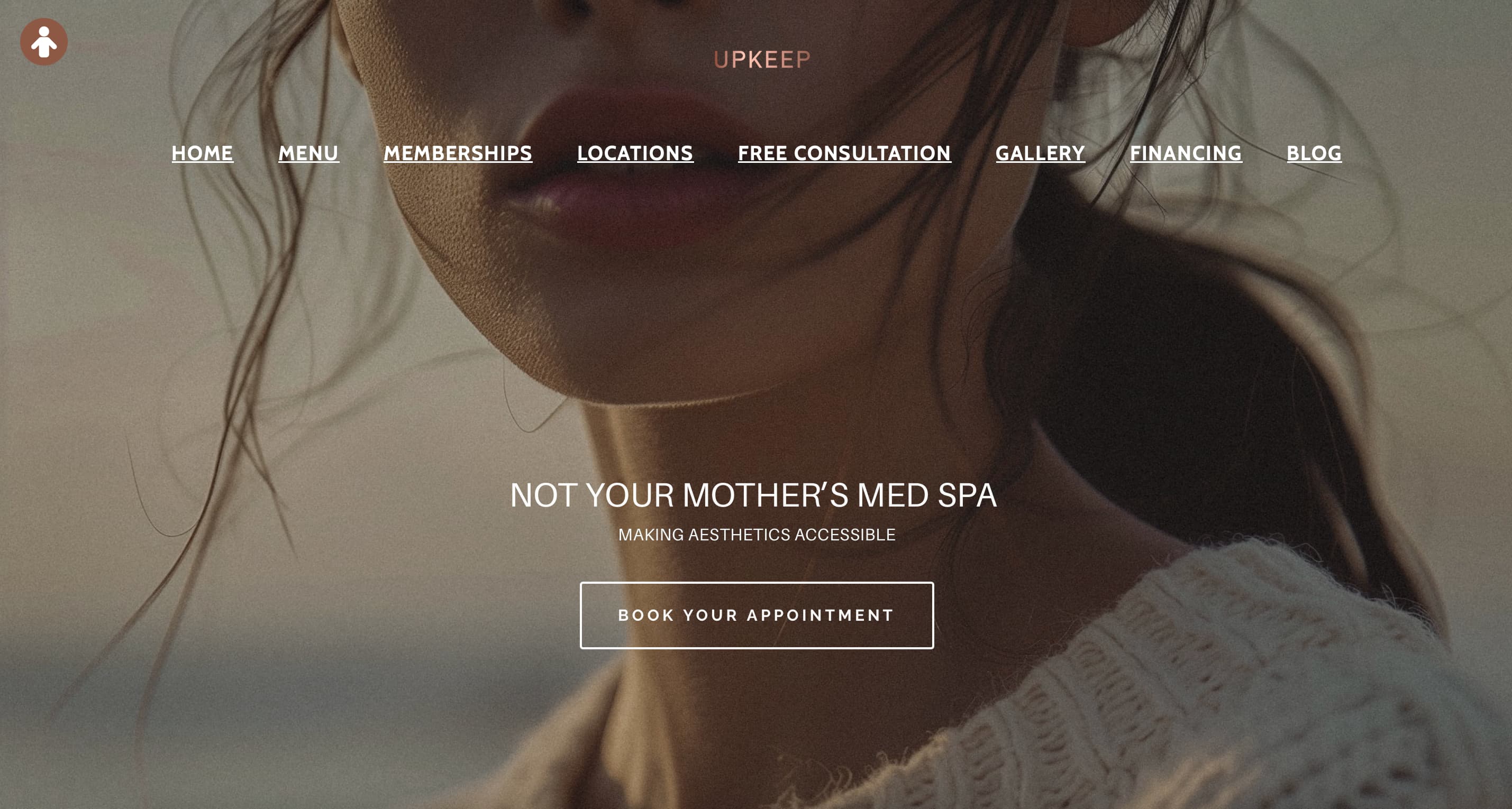
Upkeep Med Spa positions itself as a modern, accessible med spa with locations in New York City and Dallas. Their website embraces a minimalist aesthetic, featuring a clean layout with ample white space and soft, neutral tones. The homepage greets visitors with a bold statement: “Not Your Mother’s Med Spa,” immediately conveying their contemporary approach. Navigation is straightforward, with clear headings for services, memberships, and locations. Prominent “Book Your Appointment” buttons are strategically placed to encourage user engagement. The site also highlights their AI Aesthetic Simulator, allowing potential clients to visualize treatment outcomes. Mobile optimization ensures a seamless experience across devices.
Why it works: Upkeep’s website effectively communicates its brand identity—modern, inclusive, and client-focused. The minimalist design appeals to a younger demographic seeking straightforward information without unnecessary clutter. Interactive tools like the AI Aesthetic Simulator enhance user engagement and set them apart from competitors.
Design insights: The use of neutral color palettes and clean typography creates a calming and professional atmosphere. Consistent branding across all pages reinforces trust and recognition. The inclusion of real client testimonials and before-and-after galleries provides social proof and showcases their expertise.
Marketing and UX: Upkeep’s emphasis on accessibility is evident through features like online booking, transparent pricing, and detailed service descriptions. Their membership options are clearly outlined, encouraging client retention. The site’s structure guides users effortlessly from exploration to conversion.
Know your audience and tailor your site accordingly: By understanding their target demographic—tech-savvy individuals seeking modern aesthetic solutions—Upkeep has crafted a website that resonates with their audience’s preferences and expectations.
Future-ready elements: Integration of AI tools for spas and a focus on mobile responsiveness position Upkeep Med Spa at the forefront of digital innovation in the med spa industry. Their website serves as a model for blending technology with user-centric design.
Learning for others: Upkeep Med Spa demonstrates the power of aligning website design with brand identity. Their minimalist approach, combined with interactive features and clear CTAs, creates an engaging user experience. Med spa owners should consider how modern design elements and technology integrations can enhance client engagement and satisfaction.
15. Pure Medical Spa – Medford, OR
Website: puremedspamedford.com – A full-service medical spa in Southern Oregon, led by PA-C Joe Gatti, specializing in evidence-based treatments like BOTOX, HALO laser resurfacing, and EMSCULPT, all delivered in a luxurious, tranquil environment.
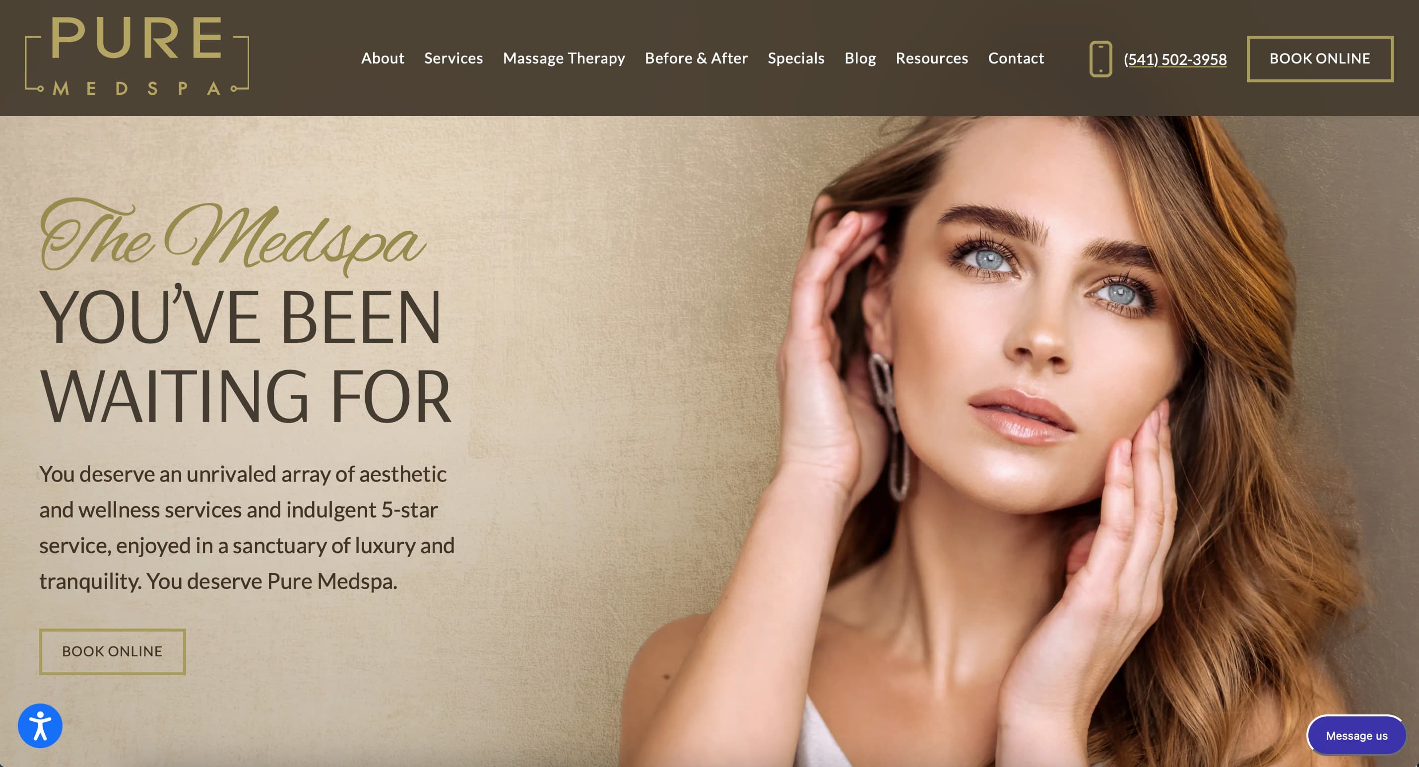
Pure Medical Spa’s website exudes elegance and professionalism, reflecting their commitment to providing high-quality aesthetic services. The homepage features serene imagery and a soothing color palette, creating an inviting atmosphere. Navigation is intuitive, with clear categories for treatments, about us, and contact information. Client testimonials are prominently displayed, offering social proof of their exceptional service. The site’s responsive design ensures optimal viewing across all devices.
Why it works: The website’s design effectively communicates Pure Medical Spa’s dedication to client care and excellence. The calming visuals and organized layout make it easy for visitors to find information and feel confident in their services.
Design insights: The use of high-quality images and a cohesive color scheme enhances the site’s aesthetic appeal. Consistent fonts and spacing contribute to readability and a polished look. Incorporating real client reviews adds authenticity and builds trust.
Marketing and UX: Clear calls-to-action, such as “Book Online” and “Contact Us,” are strategically placed to guide users toward conversion. Detailed service descriptions and transparent pricing information empower clients to make informed decisions.
Know your audience and tailor your site accordingly: Understanding that their clientele values professionalism and results, Pure Medical Spa’s website focuses on showcasing their expertise and client satisfaction. The site’s design and content cater to individuals seeking reliable and high-quality aesthetic treatments.
Learning for others: Pure Medical Spa’s website exemplifies how a clean, professional design can effectively convey a brand’s values and services. Med spa owners should consider how thoughtful design choices and user-focused content can enhance credibility and attract discerning clients.
📆 More bookings, less hassle
Workee combines website, booking, and client follow-up in one simple platform made for med spas. 👉 Book a free Workee demo
Summary: Key Patterns and How to Upgrade Your Med Spa Website
After examining these top med spa website examples, clear patterns emerge. Great med spa websites marry form and function: they are visually appealing (with cohesive branding, high-quality imagery, and calming or luxe color schemes) and they are engineered to convert visitors into clients (with intuitive navigation, fast load times, and prominent calls-to-action).
All these sites highlight social proof – whether through testimonials, before-and-after galleries, or media mentions – because building trust is essential in the aesthetics industry.
They also prioritize mobile-first design and speed, knowing many clients browse on the go. Importantly, none of them rely on gimmicky, short-lived design fads. Instead, they focus on evergreen principles: easy-to-read layouts, meaningful content (educational info, FAQs), and straightforward pathways to book a consultation or purchase. This means the sites will continue to look and feel relevant even as design trends evolve.
For med spa owners, the takeaways are practical: put yourself in your client’s shoes.
Can a first-time visitor quickly find what treatments you offer for their concern?
Is it effortless for them to schedule an appointment or request more info?
Does your site convey credibility and warmth in equal measure?
The best sites above excel at these. They also integrate modern conveniences – online booking systems, live chat support, financing calculators, even AI-based quizzes – to streamline the user journey. And behind the scenes, they ensure all forms and data capture are secure and HIPAA-compliant, safeguarding client privacy while using that data smartly for follow-ups.
If your current site falls short, now is the time to apply these insights. Even small improvements (like adding a few glowing client reviews, or making your “Contact Us” button fixed on mobile) can boost engagement. For a bigger overhaul, consider leveraging a specialized spa website builder or working with professionals who know the industry.
Platforms like Workee offer integrated solutions to turn website visitors into loyal clients with features like easy online booking and client booking automation – essentially giving you many of the tools seen in the sites above out-of-the-box.
You might also consult the best med spa marketing companies for an audit; they can identify quick wins and long-term strategies for your online presence. Remember, your website is not just a brochure – it’s a living, dynamic sales asset. Keeping it updated with fresh content (new before/afters, blog posts on the latest trends), optimized for search engines (so potential clients find you when searching for spa website inspiration or top med spa trends & treatments, and aligned with your social media and in-spa experience will position your business for success in 2026 and beyond.
In summary, the formula for a timeless med spa website is clear:
Beautiful design + powerful content + seamless functionality = more bookings and happier clients.
Use the examples here as inspiration and a benchmark. By emulating their best practices – and adding your unique brand twist – you can elevate your website into one of the “best medical spa websites” in your market. In doing so, you’re not just improving aesthetics; you’re building an online foundation for your spa’s growth. Here’s to a future where your website works as hard as you do in delivering beauty and confidence to your clients!
How Workee Helps You Build the Med Spa Website You Deserve
If your current site doesn’t reflect the level of care and professionalism you provide, it’s time to change that. Workee is an all-in-one platform built specifically for med spas — offering custom website design, integrated online booking, automated follow-ups, all in one place. Whether you want a sleek, minimalist look like Upkeep, or a bold, deal-driven style like BeautyFix, Workee makes it simple to bring your vision to life. With built-in tools to reduce no-shows, track performance, and even sell products, it’s more than a website — it’s your digital growth engine.
👉 Learn more or book a demo and see how Workee can help you turn browsers into booked clients.
You may also be interested in:
Google & Facebook Ads for Med Spas: Guide to Attracting More Patients
15 Best Medical Spa Franchise Opportunities in the U.S. (2025–2026)
2025 Med Spa Tariffs Explained: What’s Taxed, What It Costs, and How to Adapt AI for Spa and Wellness Businesses: Practical Use Cases in 2025
The Ultimate Guide to Building a Sales Funnel for Wellness Clinics and Medspas

Keep updated about latest industry insights and subscribe to our newsletter
Follow Us


